
You send a proof, the customer squints at it, nods, and approves. Two weeks later the shirt arrives and the navy is purple. Or the skin tones on a memorial photo look gray. That is the moment most print shops learn that color management on dtf transfers is not a background task you can skip. It is the thing that decides whether a first order becomes a fifth.
This guide is not about buying the cheapest film or chasing the fastest press speed. It is about the part of the workflow that quietly governs your reputation: getting the color in the file to land on the garment the way the customer pictured it. If you run a small or mid-sized shop and you have ever re-printed a job for free because the reds went muddy, this is for you.
Why DTF color behaves differently than you expect
Direct-to-film is a wet-ink process that ends in a powder cure, and every stage in that chain nudges color. The printer lays white and CMYK onto a coated film, you dust adhesive powder over it, then you press it onto fabric at high heat. Each step introduces variables that a screen printer or a sublimation shop does not face in the same way.
The film coating itself matters. A generic film with an uneven release layer will scatter ink droplets slightly differently than a quality coated sheet, and that shows up as soft edges and duller saturation. The dtf powder cure is the next lever: under-cured powder leaves a hazy, washed-out print, while over-curing can yellow the whites and shift warm colors. Then the press does its own damage, because heat and pressure interact with the fabric underneath. A 100 percent cotton tee and a 50/50 blend will not read the same color even from an identical transfer.
Stack those variables and you understand why so many shops treat color as a coin flip. It does not have to be.
Build a color baseline before you touch a customer file
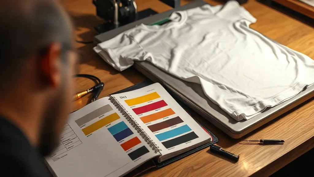
The single highest-return habit in DTF work is printing a controlled test sheet and keeping it. Not a random sample from a job, but a deliberate reference: a row of color patches, a grayscale ramp, a few skin-tone swatches, and a small photo with fine gradients. Print it, cure it, press it onto the exact blank you use most often, and label it with the date, film brand, powder, press temperature, and time.
That sheet becomes your baseline. When a customer sends a file and you are unsure how a saturated teal will land, you compare against the baseline instead of guessing. When you change film suppliers or powder lots, you print a fresh sheet and hold it side by side with the old one. If the shift is visible, you know it before a customer does.
What belongs on a reference sheet
- Primary and secondary color patches at full and 50 percent saturation
- A continuous grayscale strip to catch banding and dot gain
- Three or four skin tones across light, medium, and deep ranges
- A small photographic image with smooth gradients and fine detail
- Thin type at 6, 8, and 10 point to check edge sharpness
Keep these sheets in a binder or on a wall near the press. Physical references beat screen previews every time, because your monitor is not calibrated to your film, your powder, or your press.
Profile your printer, not just your monitor
Most shops calibrate their monitor and call it color management. That is half the job. The monitor only tells you what the file looks like; it says nothing about what your printer will actually lay down on film. You need a profile that describes the printer, ink set, and film combination you run every day.
If you have a spectrophotometer and RIP software that supports custom ICC profiles, build a profile for each film and ink combination you use. If you do not, you can still get most of the benefit by printing a standard target, comparing it to the digital original, and adjusting your RIP's ink limits and color curves until the printed target matches as closely as your equipment allows. Document the settings and treat them as fixed. Changing them mid-week to chase one job is how shops lose consistency.
One practical rule: never color-correct a customer file on an uncalibrated monitor. If you cannot trust the screen, correct using the printed reference sheet instead, and be honest with the customer about what the process can and cannot reproduce.
The variables that quietly wreck color on press
Even a perfectly profiled printer can produce inconsistent transfers if the press side drifts. The usual suspects are temperature, pressure, time, and the surface you press onto.
Temperature and time
Most DTF films want a press in the 300 to 330 Fahrenheit range for roughly 10 to 15 seconds on the transfer, then a second press after the carrier is peeled. Small deviations are tolerable, but a press that swings 20 degrees between jobs will show up as inconsistent whites and shifted warm tones. Check your press with an infrared thermometer or a press thermometer strip weekly, and do not trust the digital readout alone.
Pressure
Too little pressure and the adhesive does not fully bond, which leaves a slightly milky appearance. Too much pressure and the print can flatten into the fabric weave, losing crispness and depth. Find a pressure setting that works for your most common blank and mark it on the press. If you switch between a heavy hoodie and a lightweight tee, expect to adjust.
The blank underneath
Fabric color and composition change the final look of a transfer. A white print on a heather gray tee reads cooler than the same print on a warm cream tee. Dark garments need a solid white underbase in the transfer, and if that white is thin, the shirt color bleeds through and shifts everything above it. This is why experienced shops keep notes on how each blank in their inventory interacts with their transfers, and why choosing blanks with consistent dye lots matters more than most owners realize.
Matching customer files without promising miracles
Customers send files from phones, screenshots from social media, and photos of photos. None of those are color-accurate. Your job is to get close and to set expectations before the job runs, not after.
A simple pre-flight routine saves reprints: open the file, check the color mode, note any gradients or fine detail that will soften, and compare the key colors against your reference sheet. If a customer wants a specific brand color, ask for the Pantone number or the hex code rather than eyeballing a photo. If they only have a photo, tell them plainly that the printed result will be an interpretation, and show them a pressed sample on the actual blank before you run the full order.
For shops fielding walk-in requests, it helps to know where local production capacity sits. When a customer searches for dtf transfers near me, they usually want a fast turnaround and a shop that can show them a real sample, so having pressed swatches on hand turns a color question into a closed sale.
Handling the hard cases: neons, pastels, and photos
Some color requests are genuinely difficult on DTF, and knowing which ones keeps you out of trouble.
- Neon and fluorescent tones: CMYK ink cannot reproduce true fluorescent brightness. Expect a muted result and say so upfront.
- Deep, rich blacks: A pure black print on a black shirt can look flat. A touch of underbase or a slightly lifted black value often reads better.
- Pastels: Light tints are sensitive to underbase thickness and press temperature. Thin whites and hot presses wash them out fast.
- Photographic skin tones: These are the most scrutinized colors in the shop. Test them on the actual blank, not on white film.
When a job falls into one of these categories, build a small test press into the quote. A five-minute sample is cheaper than a full reprint and it builds trust when the customer sees you checking rather than guessing.
Documentation turns color control into a system
The shops that rarely reprint for color reasons are not lucky. They keep records. A simple job sheet that captures the file name, the film and powder lot, the printer profile used, press settings, and the blank style gives you a trail to follow when something looks off. Over a few months, those sheets reveal patterns: a particular film that runs warm, a powder lot that dulls whites, a press that drifts on humid days.
That is the real payoff of color management. It is not about achieving perfect color once. It is about making the same color happen again next month, on a different roll of film, with a different employee at the press. Consistency is what customers actually pay for, and it is the reason they come back instead of shopping around.
Frequently asked questions
Why does my DTF print look different from the proof on my screen?
Your monitor emits light while printed ink reflects it, and your printer lays ink on film that is then pressed onto fabric. Those are three different color systems. Calibrate the monitor, profile the printer, and judge final color from a pressed sample on the actual blank rather than the screen.
How often should I reprint my color reference sheet?
Any time you change film brand, powder lot, ink set, or press settings, and at least once a quarter as a routine check. If a customer ever questions a color, a dated reference sheet settles the conversation quickly.
Can DTF transfers match Pantone colors exactly?
Not exactly. DTF is a CMYK process with a white underbase, so it approximates Pantone rather than reproducing it. For brand-critical colors, print a sample on the target garment and get written approval before running the full order.
Does the garment color affect how the transfer looks?
Yes, significantly. Dark and mid-tone fabrics rely on the white underbase in the transfer, and if that white is thin the garment color shifts everything above it. Heathered and textured fabrics also scatter light differently, so always test on the exact blank you plan to use.
What causes a hazy or washed-out look after washing?
Usually under-cured powder or insufficient press pressure, both of which prevent a full bond between the adhesive and the fabric. Verify press temperature with an external thermometer, increase dwell time slightly, and confirm pressure is even across the platen before blaming the film.